Background (Figure 1):
Future Wearable Technology Co. Ltd. (SKG) was established in 2007 as a high-tech company focused on the research, design, and production of wearable massage devices.
Based on the management of human health data, SKG has been committed to making everyone younger and healthier, providing users with high-quality wearable massage products and services. They continuously integrate the finest research, design, and manufacturing resources, and their products have been selling well in cities and regions such as Paris, New York, and Seoul.
SKG's promotion faces the bidding mechanism of traffic acquisition. In such a situation, to break free from traffic extortion and establish their own traffic sovereignty, companies need to build their own brand and establish their own symbol.
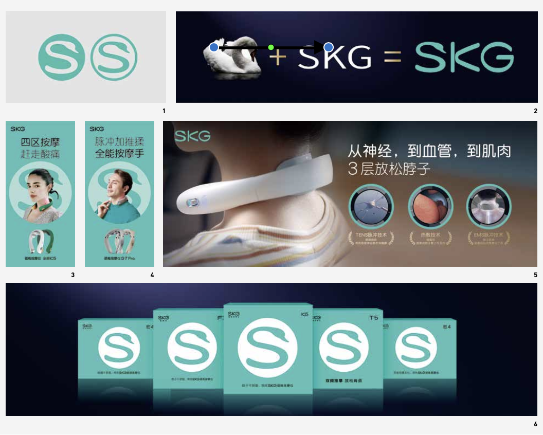
Brand Logo (Figure 2):
Super Sign is Super Traffic. Its traffic comes from the broad "cognitive foundation" and "emotional foundation" of the masses, making symbols that may not initially appear familiar immediately recognizable to consumers.
The biggest challenge in creating the SKG Super Sign is how to connect the meaning carried by the brand to the symbol, so that consumers can automatically associate it when they come into contact with the symbol, achieving the effect of knowing more from just a glance.
Hua & Hua's approach states: Super Signs are not created, but rather discovered based on the inherent dramatic nature of the brand. SKG's flagship product is the cervical massager, which is the brand's main point of contact with consumers.
When we mention a healthy and elegant neck, we often use the term "swan neck" to describe it, and a swan neck also resembles the shape of the letter "S". What's even more surprising is that the swan is a symbol beloved by people worldwide, representing purity, loyalty, and nobility, which perfectly aligns with SKG's fashionable brand positioning.
By seamlessly combining the swan neck and the letter "S," we have the Super Sign of SKG – an "S" in the shape of a swan. This transforms the letter "S" and the swan into SKG's proprietary assets, instantly bringing the brand name to life.
Advertising System (Figure 3-5):
Using the technique of overlapping amplification, SKG's print advertisements and packaging become traffic boosters by enhancing key information at different levels of space.
· First level: Fill the background with the brand colour to make it stand out on the shelves.
· Second level: Amplify the smallest memory unit of the Super Sign, the "Swan S," to accumulate brand assets.
· Third level: Amplify the spokesperson to increase celebrity appeal and have the celebrity use the product to strengthen the usage scenario.
· Fourth level: Amplify the product and super discourse to highlight the product's protagonist status and emphasize purchasing reasons.
By utilizing spatial arrangement and amplifying core information, this method of amplification is diverse yet organized, effectively conveying symbols, spokespersons, and products at a glance while providing complete information for purchase reasons, instructions, and guidance.
Packaging System (Figure 6):
Hua & Hua's approach: Everything is the same thing. Print advertising and packaging design are also interconnected. We apply this overlapping amplification design to all of our product packaging, making packaging one of the tools for display advertising. Simultaneously, it establishes shelf advantages at the point of sale, making each package an independent and free traffic collector.

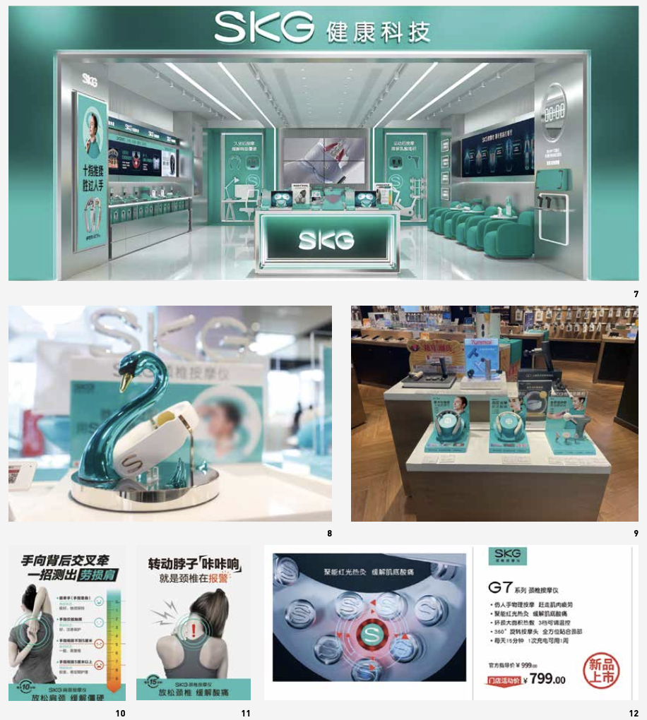
Store Design (Figure 7-9):
Super Signs are media that brands can utilize without spending money. For SKG, the upcoming flagship store will serve as SKG's Super Sign. When considering store implementation, it is necessary to think deeply from the perspective of the consumer journey—how store signage can attract consumers to enter the store and how each section can guide consumers to experience the products. SKG's flagship store divides the store into three major sections, allowing consumers to go from "seeing" to actual product experience and ultimately to making a purchase.
Passing by the SKG store, consumers are awakened by store posters and self-test display stands, capturing their attention and leading them inside. Within the store, products are displayed scientifically, and usage scenarios are created to allow consumers to experience them without hesitation. Visual representations of massage areas corresponding to each product series facilitate customer understanding and strengthen professionalism. The SKG store revolutionizes the concept of Super Signs, transforming this vast store into a constant source of traffic for SKG.
Improvement Mechanisms (Figures 10-12):
Continuously improving to create a new standard for SKG stores, meticulous efforts are made to increase productivity and effectiveness at the point of sale. The "SKG Store Sales Handbook" is developed, implemented in over 100 SKG stores and 400 counters, and the modular design of display shelves reduces costs by 200% and increases sales per square foot by 25%, helping stores enhance operational efficiency and effectiveness.
Three Key Improvement Mechanisms:
1.Product Display Shelves
Building SKG's comprehensive exhibition system from scratch to enhance brand momentum. By utilizing Super Signs and brand colors, the individual combat capability of each product display shelf is elevated, enabling every marketing tool to independently make an impact. Through standardized display shelves, a unified and orderly terminal display environment is created, fostering a vibrant atmosphere for product sales.
2. Warning Signs
Warning messages quickly capture consumer attention and engage them in interaction, such as the actions of "crossing hands behind the back to test the strain on the shoulders" and "rotating the neck with a clicking sound, indicating cervical alarm." These interactions intercept and convert store traffic effectively.
3.Product Price Tags
Each product is assigned a promotional display card and a parameter card. The key selling points of the product are presented on the promotional display card using a combination of visuals and text. Simultaneously, the parameter card presents the product model, main selling points, official list price, and store promotional price in concise and readable text and format, providing consumers with complete and efficient information services.


